Landing page best practices: 5 things to put above the fold
The five elements that do most of the work before anyone scrolls, the speed targets to hit, and how to test a page for free in one afternoon.

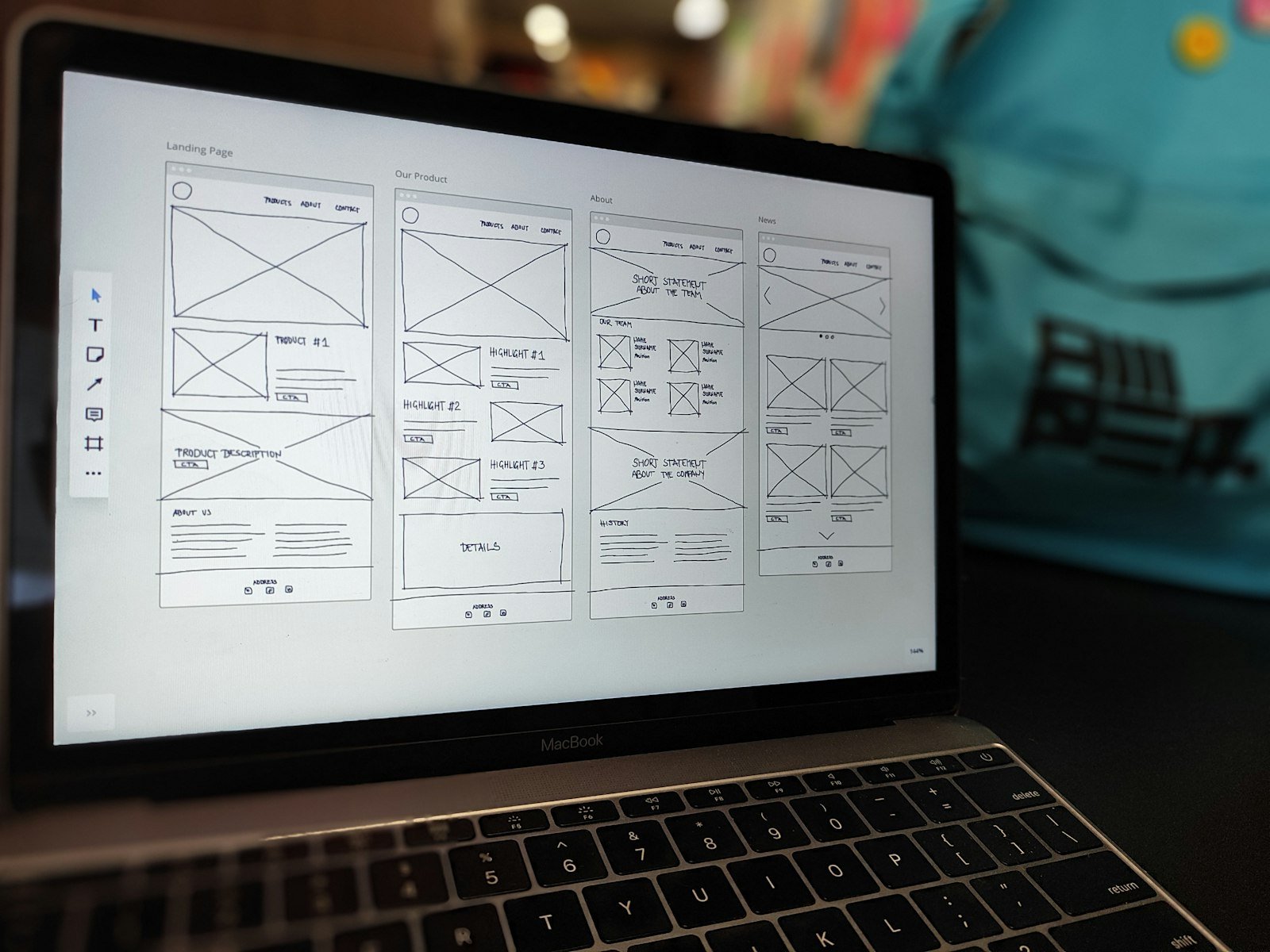
Above the fold, a landing page needs five things: a headline that names the outcome, one line saying who it is for, a single call to action, a proof point a stranger can verify, and a real image. Then make it load fast on a phone and remove everything that competes with the button.
- Eye-tracking research from Nielsen Norman Group found people spend about 57% of their viewing time above the fold.
- One page should have one offer and one primary action. Remove the main navigation on paid-traffic pages.
- Aim for Google’s Core Web Vitals targets: LCP within 2.5 seconds, INP of 200 ms or less, CLS of 0.1 or less.
- Test with real people for five seconds before you spend on ads.
Key terms explained (10)
- Core Web Vitals
- Google’s three measures of how a page feels to use: how fast it loads (LCP), how quickly it responds (INP) and how stable the layout is (CLS).
- LCP
- Largest Contentful Paint: how long the main content of a page takes to appear. Good is 2.5 seconds or less.
- INP
- Interaction to Next Paint: how quickly a page reacts when someone taps or clicks. Good is 200 milliseconds or less.
- CLS
- Cumulative Layout Shift: how much the page jumps around while it loads. Good is 0.1 or less.
- Above the fold
- The part of a web page people see before they scroll.
- Call to action
- The button or link that tells visitors what to do next, such as “Book a call”.
- Conversion
- When a visitor does what you want them to do, such as booking, buying or filling in a form.
- Plugin
- An add-on that gives a WordPress site extra features, such as SEO settings or forms.
- Carousel
- A post made of several images or slides that people swipe through.
- FAQ
- Frequently asked questions.
What does “above the fold” mean?
“Above the fold” is the part of a page a visitor sees before scrolling. On a phone that is a small area: usually a headline, a sentence, a button and part of an image. It carries more weight than its size suggests. In an eye-tracking study on scrolling and attention, Nielsen Norman Group found that people spent about 57% of their page-viewing time above the fold and 74% within the first two screenfuls.
People do scroll. They decide whether to scroll based on what they see first.
What five things belong above the fold?
1. A headline that names the outcome
Say what the customer gets, in their words. “A finished basement in six weeks, fixed price” is stronger than “Quality basement renovations”. If you run ads, the headline should repeat the promise of the ad so the visitor knows they are in the right place.
2. One line that says who it is for
Name the place, the type of customer or the situation: “For homeowners in Durham Region”, “For clinics with more than three practitioners”. The right visitor should think “that’s me”.
3. One primary call to action
Choose a single action and word the button as the next step: “Get my quote”, “Book a 15-minute call”. Use a contrasting colour and repeat the same button further down. Secondary links, social icons and extra offers all take clicks away from it.
4. A proof point a stranger can check
Use your review count and rating, a licence or certification, a guarantee, or the number of jobs completed. Only use numbers that are true and that you could show evidence for.
5. A real image
Show your team, your work or your product. A real photo of a finished job builds more trust than a generic stock image, and it tells the visitor what they will actually get.
What should I remove from a landing page?
- The main navigation on pages built for paid traffic. Keep the logo and a phone number.
- Sliders and carousels. Most visitors only see the first slide.
- Long forms. Ask for name, phone or email, and one qualifying question. Collect the rest on the call.
- Promotional language. In Nielsen Norman Group’s research on how users read on the web, objective wording scored better on usability than marketing hype, and concise, scannable, objective text together measured 124% better.
How fast does a landing page need to be?
Google’s Core Web Vitals give three targets, measured for real users at the 75th percentile:
| Metric | What it measures | Good |
|---|---|---|
| Largest Contentful Paint (LCP) | How quickly the main content appears | 2.5 seconds or less |
| Interaction to Next Paint (INP) | How quickly the page responds to a tap | 200 ms or less |
| Cumulative Layout Shift (CLS) | How much the layout jumps while loading | 0.1 or less |
Run the page through PageSpeed Insights on the mobile tab. The three fixes that usually matter most are compressing the hero image (use Squoosh and export as WebP), removing plugins and scripts the page doesn’t need, and setting width and height on images so the layout doesn’t shift.
How do I test a landing page without a big budget?
- The five-second test. Show the page to someone outside your business for five seconds, then hide it. Ask what the business offers and what they would click. If they can’t answer both, rewrite the headline and the button.
- Watch recordings. Install Microsoft Clarity, which is free, and watch ten session recordings. Look for where people stop scrolling and what they tap that isn’t a link.
- Track the one action. Set up the form submission or call click as a key event in Google Analytics 4 so you can see the conversion rate by traffic source.
- Change one thing at a time. Start with the headline, then the button text, then the image. Give each version enough visits to judge fairly before you switch.
A quick above-the-fold checklist
- The headline states an outcome and matches the ad or search that brought the visitor.
- One line says who the page is for.
- One button is visible without scrolling on a phone.
- A real proof point and a real photo are on the first screen.
- The phone number is a tap-to-call link.
- The page passes Core Web Vitals on mobile.
Tools for the job
| Tool | Use it for | Cost |
|---|---|---|
| PageSpeed Insights | Core Web Vitals and speed diagnostics | Free |
| Microsoft Clarity | Heatmaps and session recordings | Free |
| Squoosh | Compress and convert images to WebP | Free |
| Elementor | Landing page builder for WordPress | Free plan |
| Unbounce | Standalone landing pages and A/B testing | Paid |
| Google Analytics 4 | Conversion tracking by traffic source | Free |
Plans and pricing change. Check each tool's site for current details.
Frequently asked questions
Should the form be above the fold?
For short forms, often yes. For longer forms, show a button above the fold that scrolls to the form, so the first screen stays clear.
Is a landing page different from a home page?
Yes. A home page serves many visitors and goals. A landing page serves one audience, one offer and one action, usually for a specific campaign.
How long should a landing page be?
As long as it takes to answer the visitor's objections. Simple, low-cost offers can be short. Expensive or complex services need more proof, detail and FAQs below the fold.
Related playbooks
Browse every playbook on websites and landing pages, or see all marketing playbooks.
Sources
- Scrolling and AttentionNielsen Norman Group
- How Users Read on the WebNielsen Norman Group
- Web Vitalsweb.dev (Google)
Remar Catapang is a full-funnel marketing strategist based in Ontario, Canada. He has worked in marketing since 2020 and continues to lead search, CRM automation, web, paid media and experiential campaigns for businesses in Canada, the United States, Australia, Egypt and the Philippines. His playbooks are based on that ongoing work. Questions about this playbook: remarcatapangjr@gmail.com